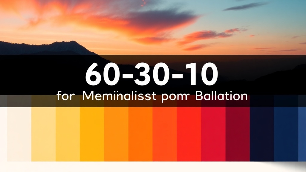
Master the 60-30-10 Rule for Perfect Minimalist Color Balance

Quick Tip
Apply the 60-30-10 rule by dedicating 60% of your room to a dominant neutral color (walls/large furniture), 30% to a secondary complementary tone (upholstery/textiles), and 10% to a bold accent (artwork/accessories) for instant visual harmony.
The 60-30-10 rule offers a straightforward framework for distributing color in any room — 60% dominant base, 30% secondary support, 10% accent punch. Nail this ratio and suddenly every wall, sofa, and throw pillow feels intentional. For minimalist spaces where restraint is everything, this rule becomes the difference between stark and stunning.
What is the 60-30-10 color rule in interior design?
It's a classic proportion guideline borrowed from design school textbooks and refined for real homes. Sixty percent of a room carries your dominant color — typically walls, large rugs, or substantial furniture. Thirty percent goes to your secondary hue through upholstery, drapery, or accent chairs. The final ten percent delivers personality via artwork, decorative objects, or a single bold lamp.
The math isn't rigid gospel. (Some of the best rooms bend toward 70-25-5.) That said, the principle holds: dominant colors recede, secondary colors create rhythm, and accents guide the eye.
How do you apply the 60-30-10 rule to a minimalist living room?
Start with the bones. In a minimalist space, your 60% should whisper, not shout — think Sherwin-Williams Alabaster walls paired with a Article Sven sofa in a matching tone. This creates the calm foundation minimalism demands.
Your 30% introduces material contrast without visual noise. A raw oak coffee table. Linen curtains in warm greige. Perhaps a West Elm bouclé accent chair — texture becomes your secondary color when the palette stays quiet.
The remaining 10%? That's where restraint gets interesting. One brass floor lamp. A single piece of oversized black-and-white photography. Or — if you're feeling brave — a terracotta vessel that catches morning light.
Here's the thing: minimalist 60-30-10 isn't about stark white everything. It's about controlled variation.
What are the best neutral colors for the 60% dominant base?
Pure white reads clinical in most Canadian light — especially during Fredericton's grey winters. Opt instead for complex neutrals with subtle undertones.
| Color | Undertone | Best For |
|---|---|---|
| Benjamin Moore Classic Gray | Warm grey | North-facing rooms |
| Farrow & Ball Skimming Stone | Greige | Open-concept spaces |
| Behr Swiss Coffee | Creamy white | Low natural light |
| Sherwin-Williams Agreeable Gray | Taupe-grey | Transitional styles |
The catch? Test samples at different times of day. That perfect greige can shift purple under LED bulbs — not exactly the vibe you're after.
Worth noting: the 60-30-10 rule scales beyond single rooms. Apply it house-wide — 60% consistent neutrals throughout, 30% repeating secondary tones room-to-room, 10% unique accents per space. Your home gains flow without becoming a beige box.
Ready to paint? Grab those sample pots. The best color scheme is the one you'll actually live with.